Home Office Colour Schemes using Dulux Colour of the Year 2024
Sep 12, 2023
Good to see you!
Otherwise login by email
Welcome to Dulux
Otherwise login by email
Terms & Conditions
Registration complete
Successfully registered, please login
Registration complete
Forgotten your password?
Please enter email address associated to your account
Change Password
Password changed successfully.
Request sent!
For more tailored inspiration, please fill in the 3 questions below.
Thanks!
Delete Account
Looking to create a colour scheme for your home? Here we show you how you can use a colour wheel to create tonal, harmonious and contrasting palettes quickly and easily.
There’s certainly an art to curating a colour scheme in your home, but there’s no denying there’s a science behind it, too. Invented in the late 17th century by Sir Isaac Newton, the colour wheel shows you how colours relate to each other and demonstrates the relationship between primary, secondary and tertiary shades. If used correctly, it can become an indispensable tool that will help you choose hues like a professional, while filling you with confidence.
Primary colours are red, blue and yellow, and are pure, which means you can’t create them from other colours, while all other colours are created from them. When mixed together, they make secondary colours, comprising orange, green and violet. These appear between the primaries on the wheel because they are formed when equal parts of them are combined (clever, right?). Tertiary colours, found between the primary and secondary colours on the wheel, are created when blending a primary colour with a secondary colour that’s next to them, the resulting hues becoming less vivid.
Now you understand what kind of colours appear on the wheel, and how they’re formed, you can start planning a scheme. There are three simple ways to combine shades: harmonious, tonal and contrasting.
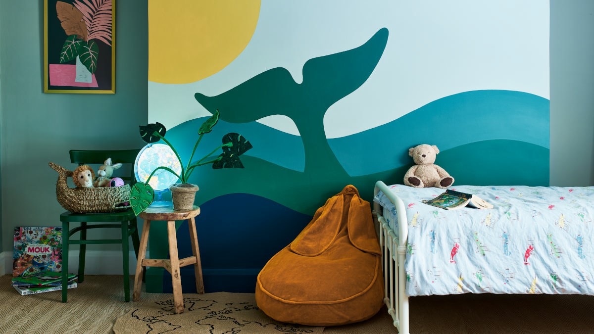
Harmonious colours sit next to each other on the wheel and create a coordinated, layered look. Spaces often feel calm and relaxing. In this child’s bedroom, we’ve combined Emerald Glade, Golden Sands, Indigo Shade, Mineral Mist, Teal Tension and Tranquil Dawn in a fun mural inspired by the beauty of the ocean. The perfect backdrop for both play and sleep.
A tonal scheme uses tones of the same colour throughout for a cohesive aesthetic. Rooms look timeless. Here, we’ve created depth and interest by painting three walls in the same open-plan space in natural Forest Lake, ethereal Glacial Spring and lush Emerald Glade. Painting the side of the staircase in Polar Storm ties the whole thing together.
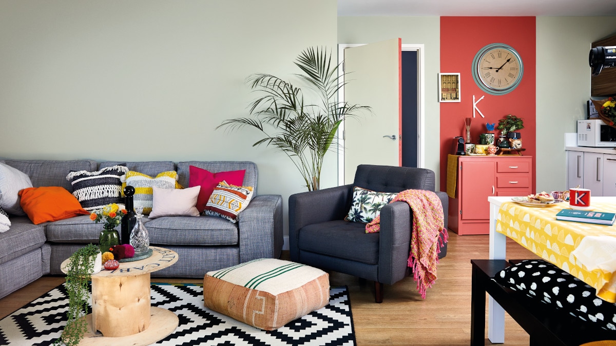
Contrasting colours lie opposite each other on the wheel to create the most dynamic and dramatic of looks. In this open-plan living room, we’ve juxtaposed relaxed Tranquil Dawn with vibrant Coral Flair to spectacular effect, while using the latter to zone a coffee station.
As well as these principles working with the Dulux Colour Wheel you can also apply them easily to any Colour Wall that you might see online or in store. Just use the horizontal and verticle lines to navigate the colours side to side, or jump 3 pillars left or right to create a contrasting palette.
Browse our collection of ready-mixed colours for the most popular shades, or take a sample in-store to have it matched then mixed, just for you. Just make sure you check which stores local to you have colour mixing, which you can easily find out here. You can see how shortlisted shades will look with our clever and convenient Roller Testers – pick-up in-store or order here.
Inspired? Share your colour schemes by using #FeelGoodColour and tagging @DuluxUK on social – you could feature on our Instagram and Facebook pages.